

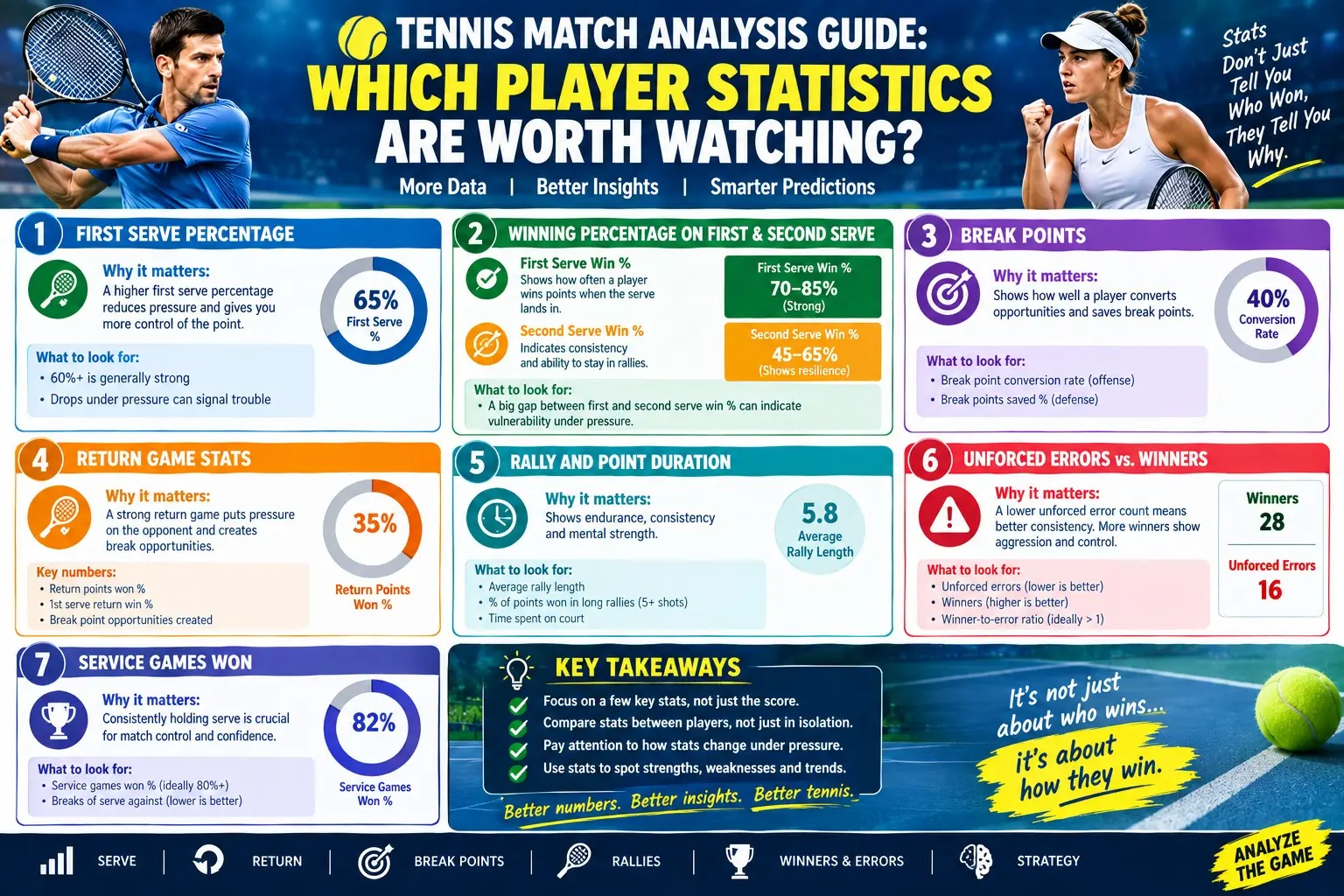
Tennis is one of the most data-rich sports in the world. Every serve speed, rally length, placement coordinate, and shot outcome can be — and increasingly is — tracked. From broadcast graphics showing first-serve percentages to advanced platforms publishing point-by-point win probabilities, fans and analysts are awash in numbers. The challenge is not scarcity but selectivity: which statistics genuinely illuminate performance, and which are decorative noise?
This guide provides a structured framework for tennis match analysis — organizing player statistics by their predictive value, explaining what each metric reveals, and showing how to combine them into a coherent picture of a match or a player's form.
1. Principles: What Makes a Tennis Statistic Useful?
Before listing metrics, it helps to define usefulness. A valuable tennis statistic should:
1. Relate causally to winning points — serving quality, return quality, and consistency directly produce score outcomes.
2. Be relatively stable — metrics that fluctuate wildly from match to match (like total aces in a single best-of-three) carry less individual signal than season-level rates.
3. Be contextualized — surface, conditions, opponent quality, and score state all frame meaning.
4. Be actionable — good statistics suggest what a player should change or what an opponent will target.
With these principles in mind, the statistics worth watching fall into five families: serving, returning, rally/shot-making, consistency/pressure, and physical/positional.
2. The Core Serving Statistics
Serving metrics form the foundation of match analysis because every point starts there.
First-Serve Percentage
How often the first serve lands in. Tour players typically sit between 58–65%. Watch for in-match trends: sustained drops below 55% often indicate fatigue or waning confidence — moments when breaks tend to arrive.
First-Serve Points Won
The percentage of points won when the first serve goes in — elite benchmark above 70%. This measures true first-strike dominance: placement, pace, and the quality of the follow-up shot combined.
Second-Serve Points Won
Arguably more telling than ace counts. Players who win comfortably above 50% of second-serve points have a safety net; those below are perpetually under siege. Regression research on top-ten players has found second-serve performance to be a statistically significant predictor of match wins.
Aces and Unreturned Serves
Aces grab headlines, but unreturned serve percentage (aces + service winners + forced errors) gives a fuller picture of serve pressure. Always adjust expectations by surface: ace rates on grass vastly exceed clay.
Double Faults
Raw counts mislead (more second serves = more opportunities to double fault), so analysts prefer double-fault rates per second-serve point. Clusters of double faults under pressure reveal nerve issues faster than any other metric.
Serve Speed and Placement Distributions
Average and max speeds matter less than where speed is applied. A player consistently landing first serves in the body on big points, or developing a new wide pattern, shows tactical evolution worth tracking.
3. The Core Returning Statistics
If serving metrics describe protection, returning metrics describe threat.
Return Points Won (Overall, First-Serve, Second-Serve)
The three-tier split is essential. First-serve return points won is the hardest to improve — even elite returners win fewer than half. Second-serve return points won separates aggressive, front-foot returners from passive blockers. Overall return points won — elite figures of 40%+ against top opposition — correlates strongly with match victories for all-court players.
Break Points Converted
A pressure-packed conversion metric. While volatile in small samples, sustained inability to convert break points (while saving few of one's own) is a red flag for mental or tactical fragility in tight sets.
Return Depth and Court Position
Advanced tracking data measures where landings land relative to the baseline. Deep, penetrating returns neutralize servers; short floats invite +1 winners. Average return position ( metres behind the baseline) also reveals tactical posture — a player backing off indicates defensive intent or discomfort with pace.
Break Rate (Games Broken per Return Games)
A clean, outcome-level summary: how often does this player break when returning? Combine with hold rate to generate a complete service/return profile.
4. Rally and Shot-Making Statistics
Once the ball is in play, rally metrics describe who controls points.
Winners-to-Untforced-Errors Ratio (W:UE)
The classic aggression-quality balance. A positive ratio suggests productive aggression; a deeply negative one indicates leaky shot-making. Context matters — on fast surfaces, higher winner counts are normal; grinding clay matches may produce lower ratios for both players even at elite level.
Untforced Error Rate by Shot Type
Breaking errors down by forehand/backhand, direction, and rally depth shows where a player is breaking down — a backhand slice error cluster against heavy topspin, for example, becomes a scouting report.
Rally Length Performance
Points ended in 0–4 shots (serve-dominated), 5–8 shots (pattern play), and 9+ shots (physical/constructive phases) have different winner profiles. Players who dominate short points but fade in long rallies — or vice versa — reveal their identity and their vulnerability.
Shot Speed and Spin Metrics
Average forehand speed, backhand speed, and top-spin rates provide stylistic fingerprints. Averaged across matches, they show whether a player is dictating (higher shot speeds) or absorbing (lower speeds, higher defensive depth).
Approach Shots, Volley Conversion, Net Points Won
For serve-and-volleyers or aggressive baseliners who move forward, net-point win percentages measure finishing quality. Elite transition players win 65%+ of net points; low conversion often explains failed aggressive game plans.
5. Consistency and Pressure Statistics
These metrics capture the invisible layer of match performance.
Points Won Under Pressure / Clutch Points
Platforms increasingly publish "big-point" performance: points won at 30-30, break point, set point. Players who elevate on these points outperform their underlying stats — a trait associated with mental resilience and experience.
Points Won on Serve vs. Return (Game Level)
Tied closely to hold/break rates, this pair frames the service-game micro battle: how close is each player to being broken? A player holding at love frequently vs. one facing break points every service game tells two different stories despite both "holding."
Total Points Won Match
Tennis famously allows a player to win fewer total points yet win the match (via concentration at key moments — famously captured in the "One Point Can Change Everything" phenomenon). Total points won is a useful reality check: if a winner won only 48% of total points, the performance may be less dominant (or luckier) than the scoreline suggests.
Aces Saved vs. Double Faults at Key Scores
Pressure serve audits — what happens to first-serve percentage at 4-5 or 30-40? These micro-trends expose clutch ability or fragility.
6. Physical and Positional Statistics
Modern wearable and tracking data add a physical layer:
· Distance covered and high-intensity sprint counts: Workload proxies — heavy travel weeks and long three-setters accumulate.
· Average rally movement speed: Declining numbers across a tournament can signal fatigue.
· Court positioning heat maps: Is the player owning the baseline, pinned deep, or constantly pulled wide? Heat maps visualize stylistic dominance better than any single number.
· Time between points and between first/serve second serves: Tempo indicators — rushed timing can suggest distress; deliberate pacing can signal control (or gamesmanship, depending on context).
7. Statistics Worth Watching Less Than You Think
Intellectual honesty requires flagging commonly over-weighted metrics:
· Single-match ace totals without surface/opponent context.
· Unforced error counts alone — without knowing shot difficulty, they punish attacking play equally with careless play. The W:UE ratio or error-per-rally rates are richer.
· Raw serve speed maxima — one 230 km/h bomb means less than a consistent 70% first-serve points won.
· Set scores in isolation — a 6-0 set may reflect opponent implosion more than sustained excellence; underlying point ratios clarify.
None of these are useless — they are simply incomplete without context.
8. Combining Statistics: Building a Match Analysis
A disciplined analysis sequence for any match:
5. Service foundation: Compare first-serve %, first-serve points won, and second-serve points won for both players. Who protected better?
6. Return pressure: Return points won splits, break points created/converted. Who threatened more often?
7. Control metrics: Winners, unforced errors, rally-length splits. Who dictated the style of point?
8. Clutch layer: Performance at 30-30+, break/set points. Who lifted when it mattered?
9. Physical layer: Movement data, if available — did intensity drop in the third set?
10. Context check: Surface, conditions, opponent style, and recent schedule — does the story hold?
11. Prediction: Which metrics suggest sustainable advantages, and which look like variance about to correct?
This layered approach mirrors how professional coaches review video: numbers first to find questions, video second to answer them.
9. Tournament and Season-Level Analysis
Across longer samples, the hierarchy of useful statistics stabilizes:
· Hold % and break %: The strongest single indicators of match-winning consistency on tour.
· Service points won and return points won (combined): Broad quality measures used in Elo-style tennis ratings.
· Record in deciding sets and tiebreaks: Pressure performance over time — career tiebreak win % is remarkably stable for players, suggesting genuine skill component.
· Surface-specific splits: Identifying where a player's game translates (e.g., strong return metrics translating better to clay than serve-dominant profiles).
· Performance vs. opponent quality tiers: Beating lower-ranked players means little for elite projection; results against top-20 opposition reveal true level.
Fantasy players, bettors, and performance analysts all benefit from prioritizing these stable, causal metrics over headline counts.
10. A Practical Checklist for Fans
When watching a match with an analytical eye, track these six live indicators:
12. First-serve percentage trend (both players).
13. Second-serve points won (who owns the weaker delivery?).
14. Break points saved/converted tally.
15. Winners vs. unforced errors balance.
16. Rally-length dominance (who wins the 0–4 shot phase? the 9+ phase?).
17. Body language and movement quality at big points — the qualitative data that explains quantitative shifts.
Six markers, updated set by set, produce a richer narrative than any graphic the broadcast chooses to show.
11. Building Your Own Match-Tracking Template
For viewers who want to move beyond passive watching, constructing a simple live template sharpens analysis. Before the match, note each player's season baselines: first-serve percentage, service points won, return points won, and break-point save rate — these become the reference lines against which live performance is judged. During changeovers, update six tracked numbers: first-serve %, first-serve points won, second-serve points won, winners, unforced errors, and break points faced/converted. After each set, add a narrative line — which patterns held, which shifted, and what the underlying numbers suggest about sustainability. Over a tournament, these sheets accumulate into a personal dataset: you will notice, for example, that a player's third-set first-serve percentage routinely dips below 55%, or that their break-point conversion spikes on clay but not hard courts. The exercise trains prioritisation — you learn to weight stable, causal metrics over broadcast novelties — and it aligns amateur observation with the review process coaches use when dissecting video with performance staff. Whether kept in a notebook, spreadsheet, or notes app, the template converts passive viewing into active, research-style analysis worthy of any serious student of the sport.